health.com.au
Keeping the users on-board
Project Story
health.com.au has suffered from high lapse rate in 2019. It has been observed that most of the lapses are occurring right after onboarding, within sixty days. On average, 25% of users in the market change their health fund to another to find better promotions, but for health.com.au, 30% of them cancel their policy due to poor experience. The challenge that health.com.au faces is to find which part of the onboarding experience is the most painful and fix it.

Empathising the users & employees
What are the pain points? What do they need? WHY?
“I don’t understand why I am doing this again.”
Health insurance is a very complicated matter for the users and also for the providers, because of the many moving parts and multiple organizations that control the systems and processes. Moreover, online aggregators may offer a wider range of products, but lack transparency which complicate the customer’s understanding of the the process, payments and product coverage. This often results in the customer having to double check with the provider’s website. With this background knowledge, the biggest challenge for health.com.au is understanding where the most biggest pains in the on-boarding process are.
Where is the bottle neck – Service blueprint

To get the holistic view about the user journey, industry regulations, operation processes and customer touch points, I developed the service blueprint with the stakeholders, including the service agents who work closely with the customers. This service blueprint was focused specifically on the ‘onboarding’ process, so to dive into the issues directly.
The service blueprint also helps everyone to have a clear view of all external parties involved, allowing us to understand all causes of friction in the system
Visual communication
I made the service blueprint into a visual communication map and positioned it in the office’s most crowded area, so anyone who would pass by, was able to drop ideas or thoughts.
This also gave employees an opportunity to participate on the improving User experience and feel more ownership of the project.

Defining the opportunity
Can we minimize the pain for both users and employees?
Our ideal onboarding state
Through the service blueprint session, we discovered that the onboarding process is not just complex, but contains many internal processes which are not clear and uselessly replicated.
In the light of this, I created a journey map for an ideal state and discussed it with the experts of the specific areas, including customer experience, development and 3rd party services, to come up with the most suitable solution for the current situation.

Optimised user journey
Through multiple workshops and meetings, we were able to finalise a suitable user journey which works for everyone.


Design the experience / Testing and iterate
Does this work for everyone?
The whole process for design took 2 design sprints (4 weeks) based on the research and workshops. This includes regular design reviews for each stage (eg. Journey map, mid-fi and hi- fi) with stakes holders so that they can provides the relevant feedbacks as well as be on the same page as the rest of the team. Through this process, I could create and validate the ideas with a quick prototype to test and gather feedback.
User flow & multiple scenarios
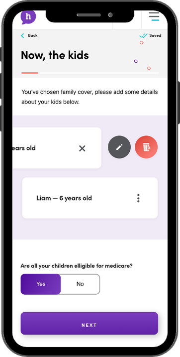
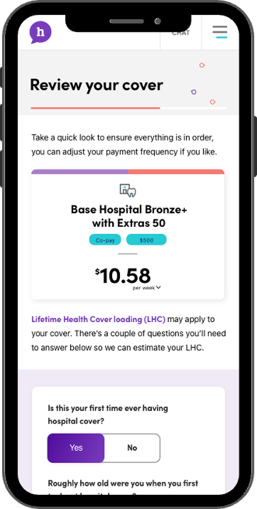
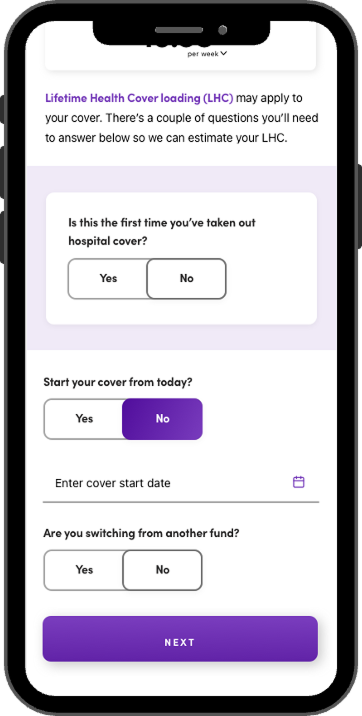
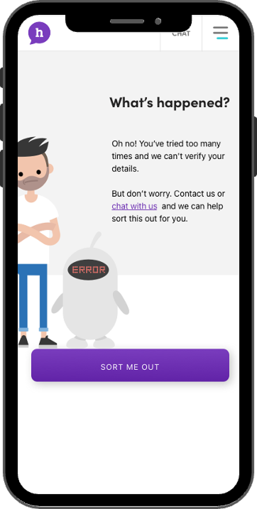
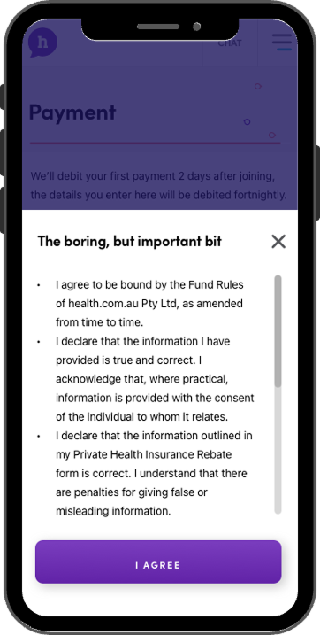
The onboarding process for users is a linear process, just like as sign up or payment, however I had to think about multiple scenarios to create a consistence & pleasant experience. Many tests and discussions were essential to achieve the target.
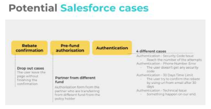

Prototype, prototype, prototype
For this project, creating prototypes based on multiple scenarios were critical as it can lead the user to a dead end if we do not think thoroughly about all cases. I put lots of time and effort to create these and run it with developers as well as the customer experience team to cover all the situations.
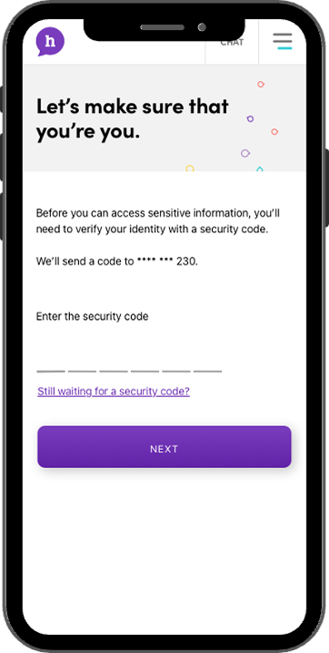
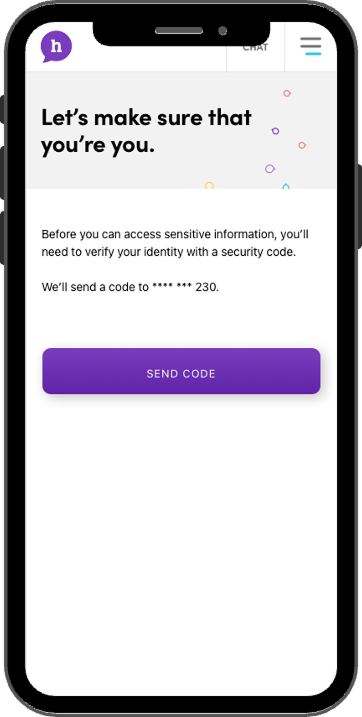
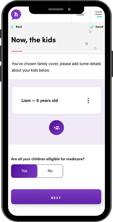
Communicate with relevant stakeholders
The onboarding process is not only relevant to the users, but also important to the employees who do the manual work if necessary. It is important to provide up to date information to them so they can answer the enquiries from the customers quickly.
For this project, I have held several showcase sessions to cover the changes for the internal processes. This session was also very helpful to gain feedback for the future iterations.
Testing multiple times
Functional testing for this project was essential as the whole experience can go bad based on it.The onboarding process can be simple for the user, we want to ensure all the steps for each scenario work well and all the information is displayed correctly.
I was in charge of all the testing, including QA and QC, writing the testing scenarios to not miss any important piece of the journey. When we find issues during the tests, we identify whether that is the technical error or process error, and fix it or iterate the process.
Launching the project
Where to from here?
The key success point for this project was to reduce the lapse time in the 6 months following the delivery. Through the new process, I was able to clearly see that most of the rebate confirmations were now done within 7 days, where previously, it would have taken up to 30 days. This was a great achievement, and we will keep track of this data in the long run, as more improvements can be done or faults avoided.
I will continuously observe the users’ behaviour via the full story, gathering feedbacks from them and make use of more advanced web analytics to improve the process even further.

My takeaways
+ Prototype helps a lot to communicate with cross-functional teams effectively.
+ Work closely with the co-workers who hear the customer’s voice often.
+ Lots of discussions and workshops with relevant teams reduce future mistakes and or doubled up work.
Some of my projects

Scheduling Intelligence - Telstra HealthEnd to end UX
Design System - Telstra HealthStyle Guide to Component Library
Wound chart enhancement - Telstra HealthEnd to end UX

Redesign the website - health.com.auEnd to end UX | Service design

Wealth management application | BMYGEnd to end UX | App design | Project managment

EduFlix - ACMIACMI Xcel Accelerator finalist project
SHOUT - Deakin SparkDeakin Spark Accelerator project
© Shin Lee 2024
Are you looking for a designer who believes that little things can make a big difference, a vintage fan who still buys films for her classic camera, loves animals, especially the ones with four legs?
If so? Please do get in touch