Design System
The way of efficient consistent working: Design System
Project Story
Telstra Health Aged Care team manages multiple products, but there was no dedicated Design System in place. The main product, which has been around for 15 years, has an outdated, inconsistent, and inefficient interface. Building new components from scratch was time-consuming, and developers in each product frequently created components individually, leading to further inconsistencies across the product. This fragmented approach not only slowed down the development cycle but also negatively impacted the user experience, as accessibility and interactions varied significantly.
The Challenge
- Outdated and inconsistent components: Many components lacked a unified design language, making the user interface feel fragmented.
- Time-consuming component creation: Building components from scratch significantly slowed down the product development process.
- Lack of standardization: Each developer built components individually, resulting in inconsistencies in code and design.
- Existing style guide limitations: The current style guide had not been thoroughly audited for accessibility and did not always meet the product's requirements, leading to inefficiencies.
- Accessibility gaps: There was no consistent approach to ensuring that components adhered to accessibility standards, affecting the user experience for all users.
To address these challenges, we embarked on a comprehensive redesign of the design system, with a focus on standardization, efficiency, and accessibility, while revisiting and refining the existing style guide.
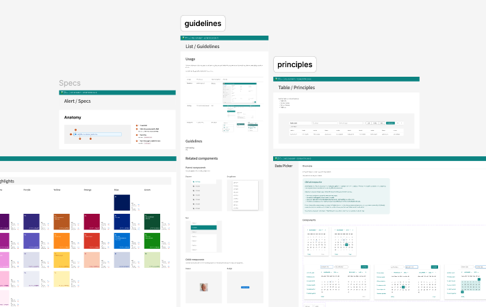
How it started
Revisiting the Style Guide
We conducted a full audit of the existing style guide, identifying areas where it didn’t meet the needs of the product or accessibility standards. The style guide was revised to ensure it supported a cohesive, accessible, and efficient design process.
Identifying Key Components
We began by auditing the entire product, identifying the most commonly used components and interactions. This allowed us to prioritize which components needed immediate attention and to build a more unified library that aligned with the updated style guide.
Standardizing Interactions and Accessibility
Consistency in interaction patterns and accessibility standards became a cornerstone of our new system. We ensured that each component adhered to WCAG guidelines, improving the product’s usability for all users.
Collaborating with Developers
Building a shared developer component library posed unique challenges, as different product teams used various code languages and versions. To address this, we opened up ongoing discussions with developers about how to standardize and streamline the component-building process. It was crucial to consider the impact on product delivery timelines, which required close coordination with the product teams to ensure development could proceed efficiently without disrupting feature or product releases.
Key Outcomes
In the end, the overhaul of the design system resulted in a consistent and efficient approach to product development.
Consistent Style Guide with:
- Accessibility-audited color guide: Colors were chosen and tested to meet WCAG accessibility standards.
- Consistent iconography: Unified icon styles across the product for a coherent visual language.
- Font style: A clear and unified typography system, ensuring readability and brand consistency.
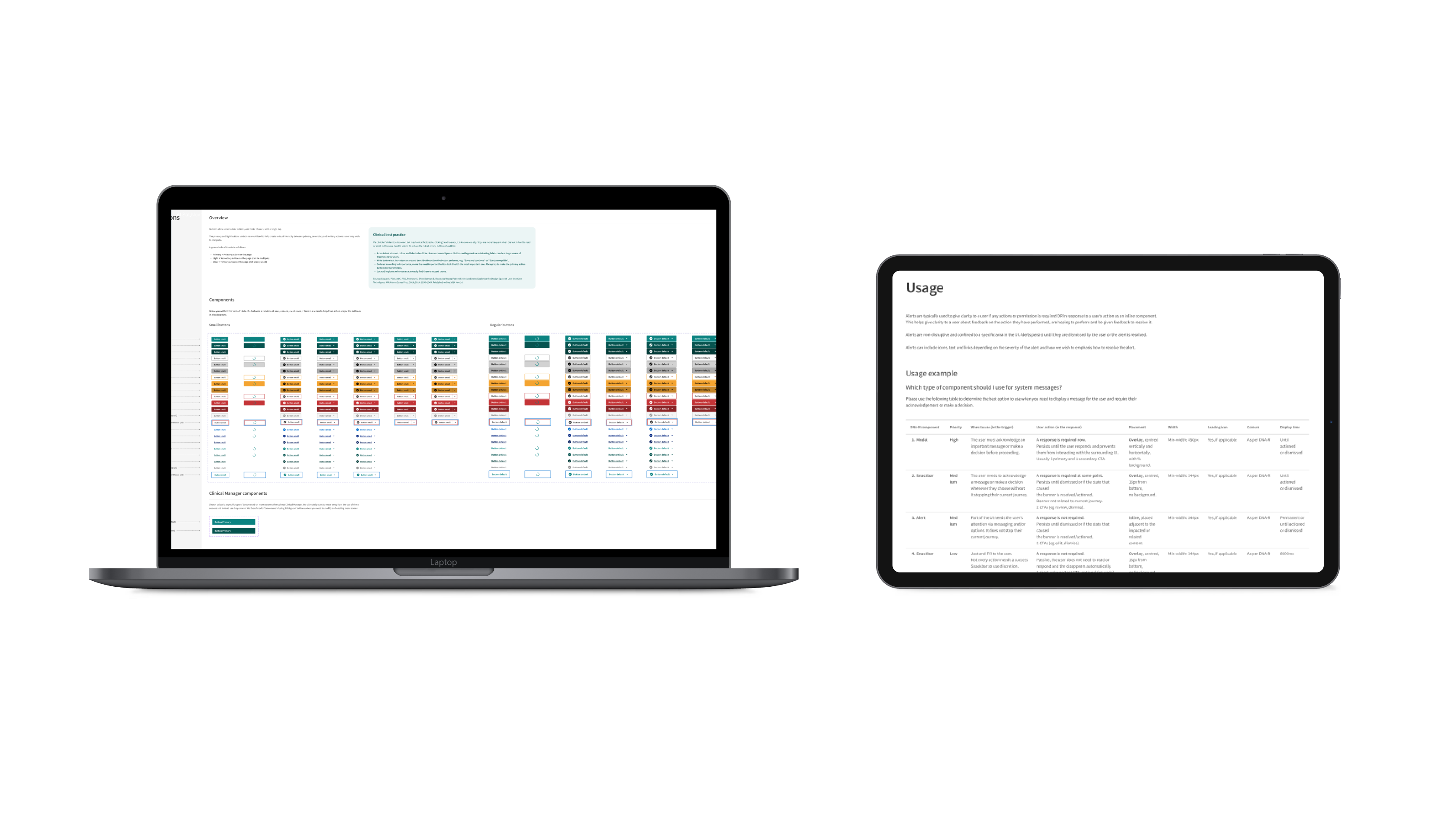
Component Library with:
- Clear documentation with use cases: Every component in the library was documented, with detailed use cases to guide developers and designers.
- Defined interactions and color guidelines: Each component included precise interaction patterns and color usage, ensuring consistency across the product.
- Consistent component naming and descriptions: Components were named and described in a standardized way, making it easier for developers to implement them efficiently.
- Documenting and Scaling: We meticulously documented the design system, including detailed guidelines for each component, interaction, and accessibility requirement. This documentation served as a single source of truth for both designers and developers, facilitating easier scaling and onboarding for new team members.
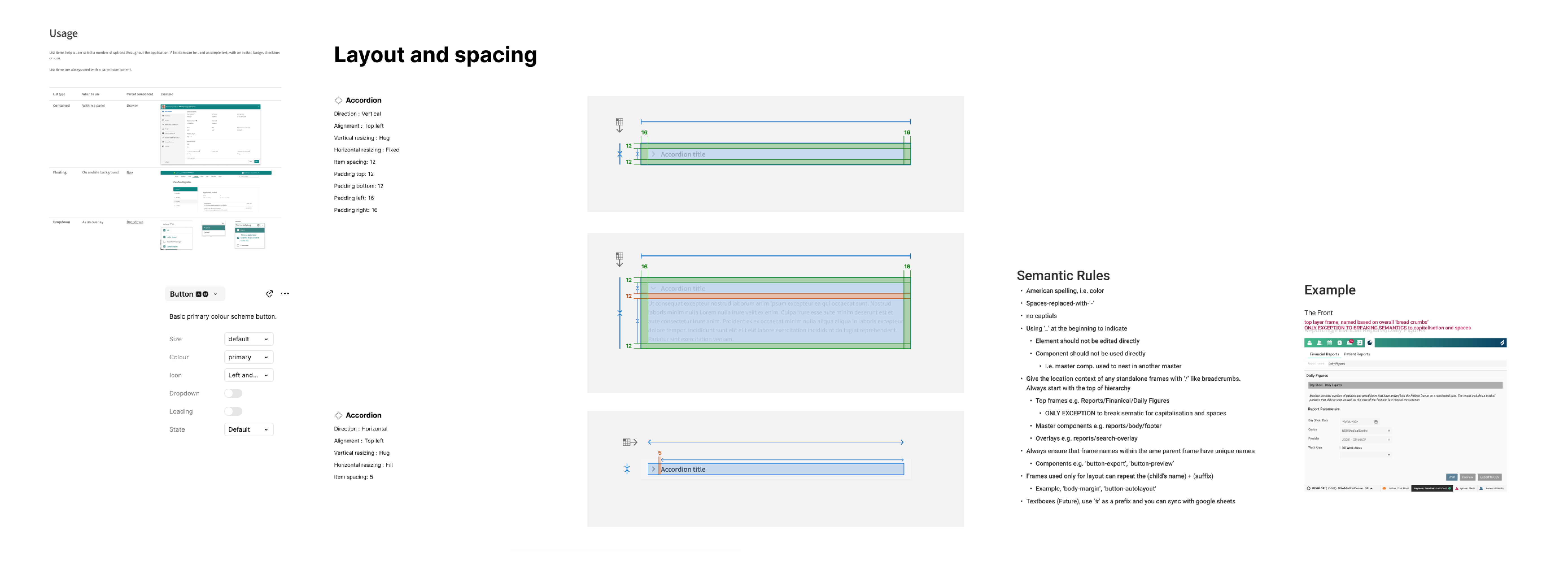
Moving forward
Design systems are not static: They continuously evolve as the needs of the product change. To ensure the design system stays current, we established fortnightly meetings to discuss updates, new industrial standards, and any changes needed to maintain efficiency. Collaboration with both developers and product teams remains ongoing as we work to address any future challenges.
We also continue refining the developer component library to streamline its use across different product teams, especially since teams work with varying code languages and versions. This process requires careful coordination with product teams, considering the impact on product delivery timelines.
My takeaways
+ Researching Industry Standards and Health Guidelines is Crucial
+ Communication and Collaboration are Key
+ A Design System Benefits the Entire Team
Some of my projects
Scheduling Intelligence - Telstra HealthEnd to end UX
Wound chart enhancement - Telstra HealthEnd to end UX

Onboarding experience - health.com.auEnd to end UX | Service design

Redesign the website - health.com.auEnd to end UX | Service design

Wealth management application | BMYGEnd to end UX | App design | Project managment

EduFlix - ACMIACMI Xcel Accelerator finalist project
SHOUT - Deakin SparkDeakin Spark Accelerator project
© Shin Lee 2024
Are you looking for a designer who believes that little things can make a big difference, a vintage fan who still buys films for her classic camera, loves animals, especially the ones with four legs?
If so? Please do get in touch