Telstra Health
The schedule system which makes your life easier

Project Story
Community Connect is one of Telstra Health's products which supports the organisations that are sending support workers to the Care Recipients’ houses. The biggest challenge that Community connect faces was to provide an efficient scheduling system so that the scheduler spends less time scheduling and finding the perfect workers to take care of the recipients.

Empathising the users & employees
What are the pain points? What do they need? WHY?
“We spend half a day for scheduling”
After having multiple interviews with Internal stakeholders, the business analysts who work closely with the clients and other product teams who have similar challenges and solutions, I created a Miro board to collaboratively share findings and thoughts with the teams.

What's out there
The problem and the scope are well known, there is a variety of mature products on the market already, for this reason i spend time meticulously researching other competitors and existing solutions.


Where we are at
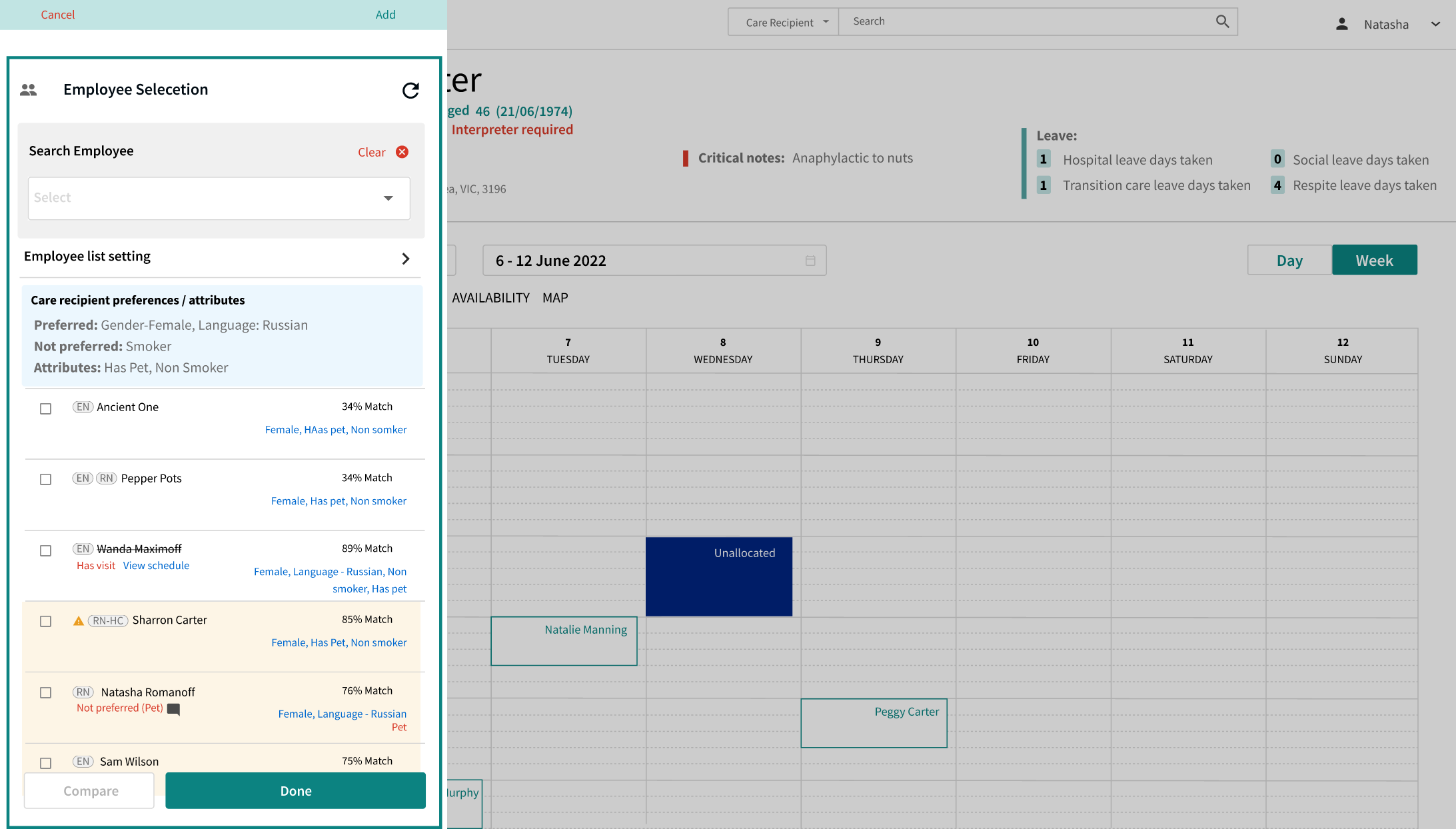
To start the discussion and provide a direction, I needed to understand the current status of Community Connect, this helps me to think about the potential future outlook. All the steps have been displayed with screenshots of relevant pages so that the BA and Dev team could also understand visually which pages needed to be changed and improved. I find that visual communication is very important to decrease time to production by removing misunderstandings.


Defining the opportunity
Can we minimize the pain for both users and employees?
Lots of ideas with such a limited space
Because scheduling is one of the big and main tasks that our users do on an everyday basis, we had lots of ideas that we wanted to implement. However, the main screen for scheduling is very small and busy already and it’s not feasible for us to redoit from scratch. So after the discussing with the main clients (users), I narrowed down the ideas to the most critical ones to minimise the scheduling time so that users can worry less about who should go to the Care recipients.

Design the experience / Testing and iterate
Does this work for everyone?
As this project is very big with multiple layers of connection between functionalities and communications, it won’t be able to fix everything in one go. Therefore we divided the project into smaller objectives in order to tackle them one by one and drew separate flows so that I could communicate the solution to the team effectively.
The outcome
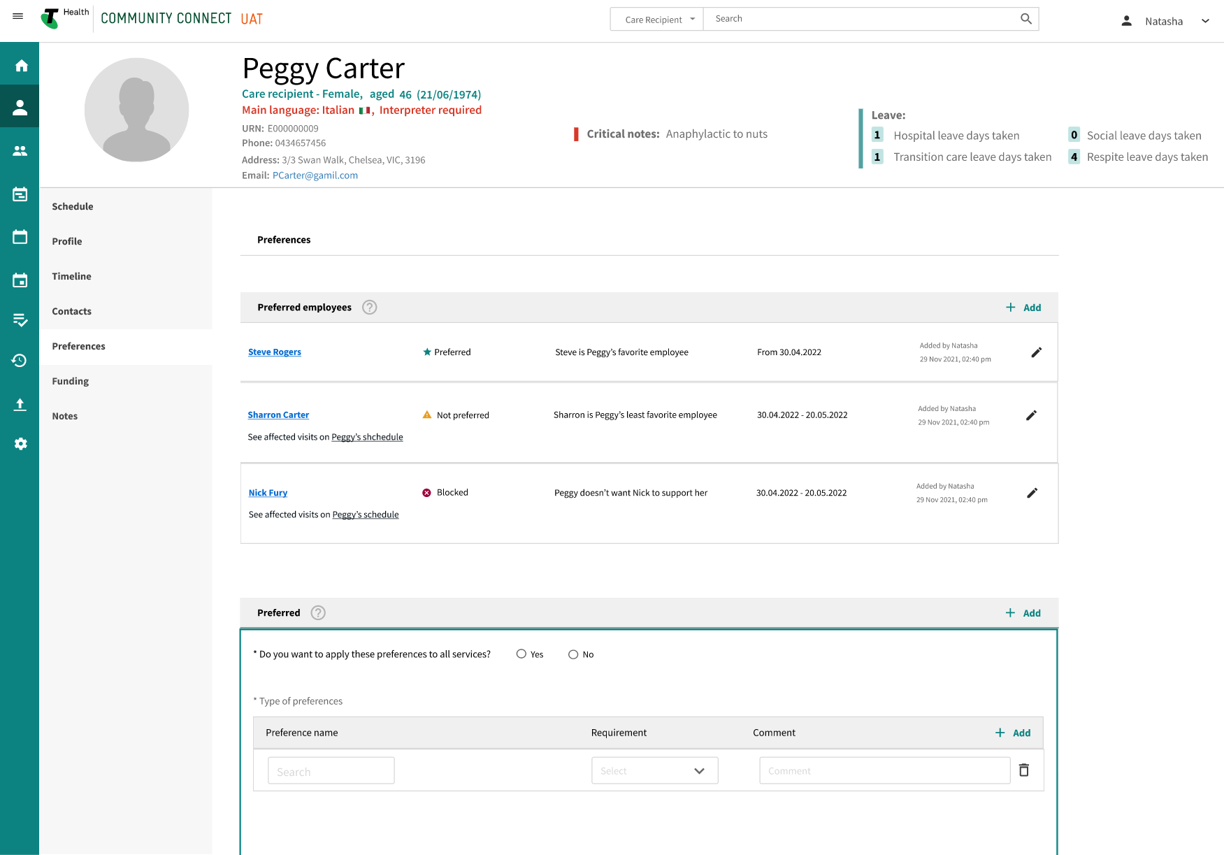
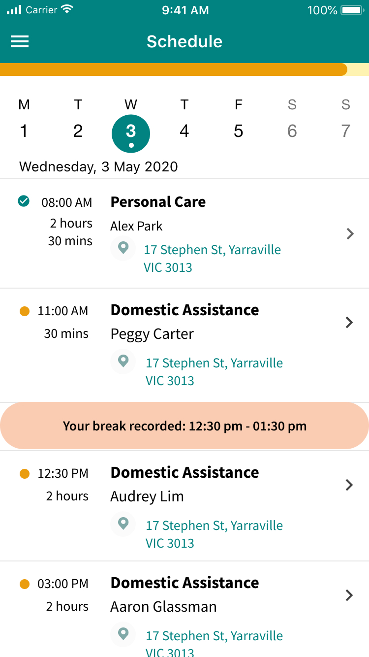
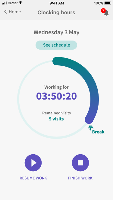
- I designed a system that allows users to configure and schedule tasks based on specific attributes and preferences, seamlessly communicating with caregivers' mobile app to capture information during their shifts
- The user testing process was highly successful, providing valuable insights and confirming that the design met user needs effectively
- Feedback was very positive, and the testing results validated key design decisions
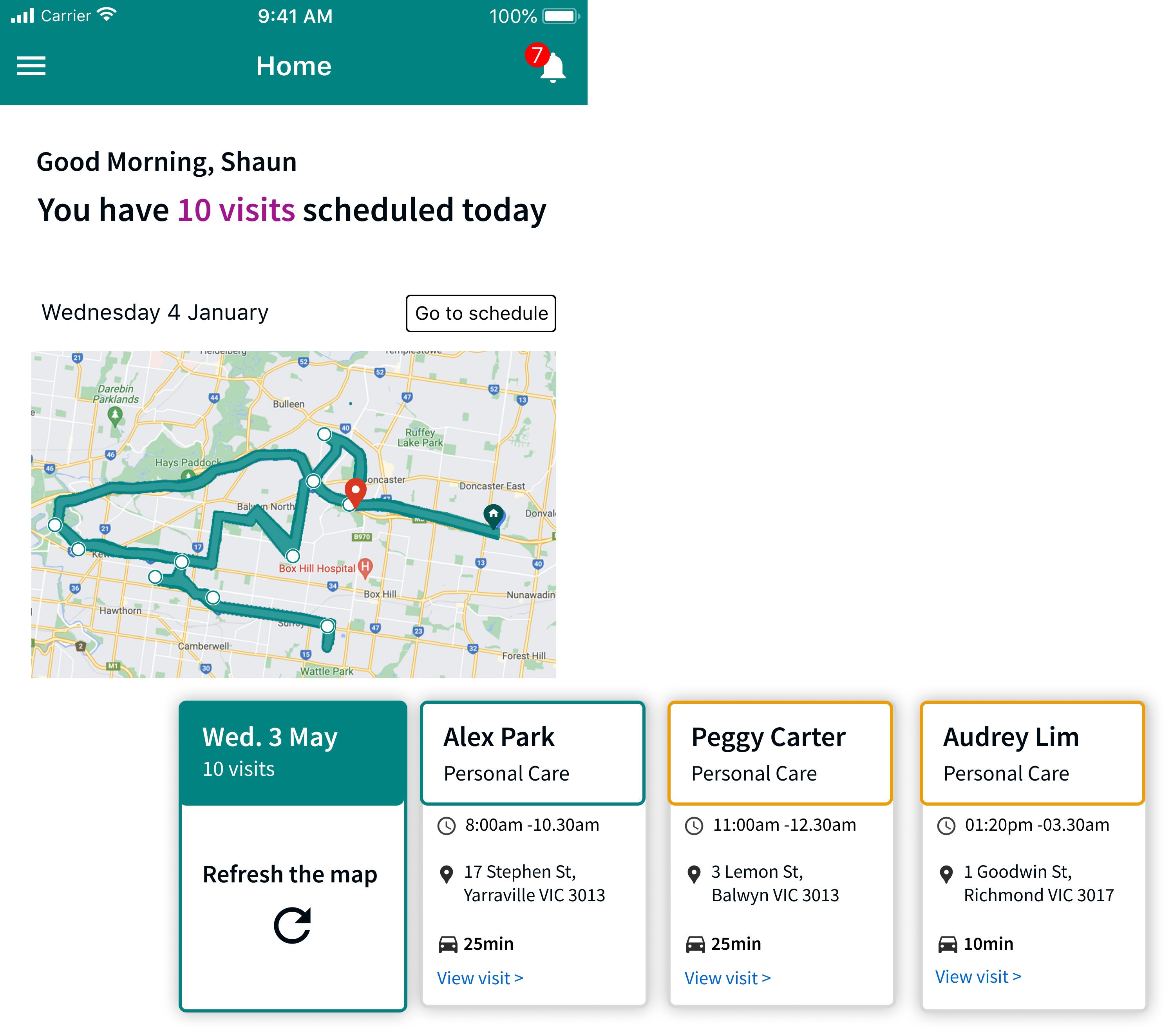
Iterate and Testing
The most challenging part for me at this stage was using real data. With the dummy data that I had readily available, the stakeholders and users couldn’t see the potential issues that could happen in real life, as dummy data is generally clean and simple. To overcome this limitation, I used excel to fabricate more realistic data (real data) and simulated all the numbers which can be used for the prototype. With this data, I was able to create a much more realistic prototype, more similar to real life.
This allowed me to collect useful feedbacks and results.
My takeaways
+ Use real data if you can to minimise the potential issue in future
+ Discuss feasibility with the developers constantly
+ Learn to let go lots of good & fancy ideas and keep a few essential ones helps the user better most of the times.
Some of my projects
Design System - Telstra HealthStyle Guide to Component Library
Wound chart enhancement - Telstra HealthEnd to end UX

Onboarding experience - health.com.auEnd to end UX | Service design

Redesign the website - health.com.auEnd to end UX | Service design

Wealth management application | BMYGEnd to end UX | App design | Project managment

EduFlix - ACMIACMI Xcel Accelerator finalist project
SHOUT - Deakin SparkDeakin Spark Accelerator project
© Shin Lee 2024
Are you looking for a designer who believes that little things can make a big difference, a vintage fan who still buys films for her classic camera, loves animals, especially the ones with four legs?
If so? Please do get in touch